

Dear @Pfizer:
Great job on launching your Antimicrobial Testing Leadership and Surveillance (ATLAS) website today, which is “designed to provide physicians and the global health community with easy access to critical data on the efficacy of various antibiotic treatments and emerging resistance patterns across more than 60 countries.”
You also announced that:
ATLAS offers an interactive platform that enables physicians to evaluate data, conduct analyses, and export tables and figures that include parameters such as pathogen, region, specimen source and in vitro susceptibility data. The ATLAS database is updated every six months with new resistance data from healthcare institutions in more than 60 countries as these become available. ATLAS can be accessed by visiting: www.atlas-surveillance.com.
That’s an amazing commitment to using dataviz to improve the quality of life around the world. Just one thing:
Can you offer something other than hard-to-understand and misleading 3D bar charts to display your data as shown in the desktop view below:
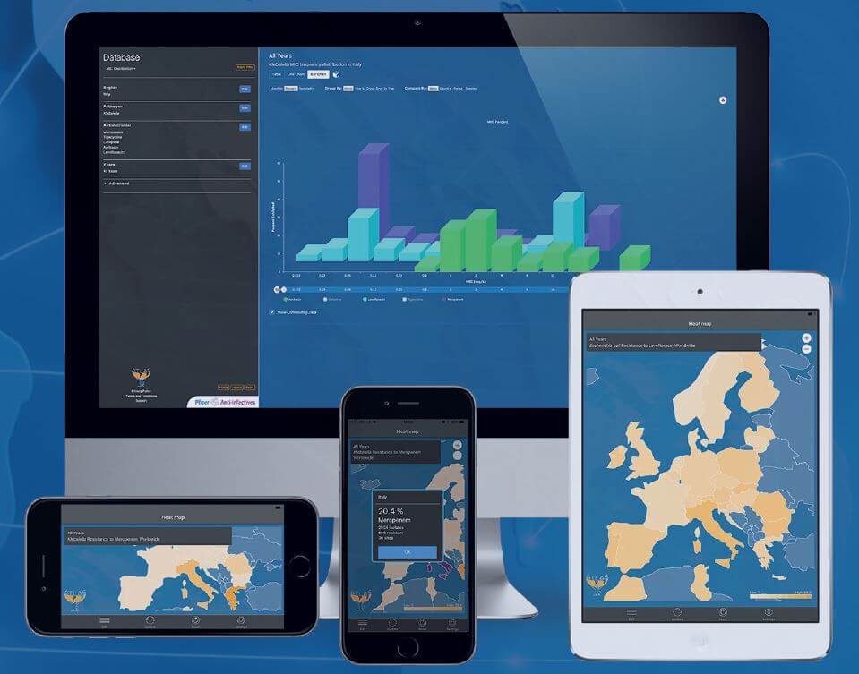
ATLAS can be accessed through atlas-surveillance.com and can be downloaded on mobile phones through the App Store (Graphic: Business Wire)
Have Edward Tufte (The Visual Display of Quantitative Information![]() ) and Stephen Few (Information Dashboard Design: Displaying Data for At-a-Glance Monitoring
) and Stephen Few (Information Dashboard Design: Displaying Data for At-a-Glance Monitoring![]() ) not been part of your UX/design group’s resources?
) not been part of your UX/design group’s resources?
I am not mitigating the importance of what this program and website are offering. Much the opposite, I want to see it be as successful and an inspiration for other pharmaceutical companies.
So keep updating the site and improve the data visualizations to follow best practices that will help the physicians, researchers and entire medical community. There are many ways to make that information easier to understand, across all the devices you want to display them on.
As you formally unveil ATLAS today at the annual meeting of the European Congress of Clinical Microbiology and Infectious Disease (ECCMID) in Vienna, tell them you will continue to work on the usability of the site, and keep improving its utility.
Visually yours,
Dean Meyers


